Hey looks guys, games journalists are here to write about toys in a way no-one else does (except all the people that do that they haven’t bothered reading, because that’s not what New Games Journalism is about).
Long-term followers: this is me applying my RPS style to toys. Gags, analysis, diversions, existential crisis.
Other folk: this is me trying to write about stupid toys in a way no-one else does.
New subs very welcome, ofc! It’s all free.
https://bsky.app/profile/bonzrat.bsky.social/post/3lsxoyuvt7s2a
I mean honestly, it’s a fair enough bit of writing, but woof that attitude. Matt from Dino Drac alone has been writing about toys in this kind of way for over 20 years.
Anyway, I got new toys recently!
I find it kinda hard to talk about GI Joe Classified figures now because the level of quality is so good that there’s often not much to say. “Oh, it’s another perfect updating of a classic design in a 6″ scale, ho-hum”. And this is pretty much the case with the Joes (Cobras, more accurately) I got this week, after a long 9 month pre-order wait.
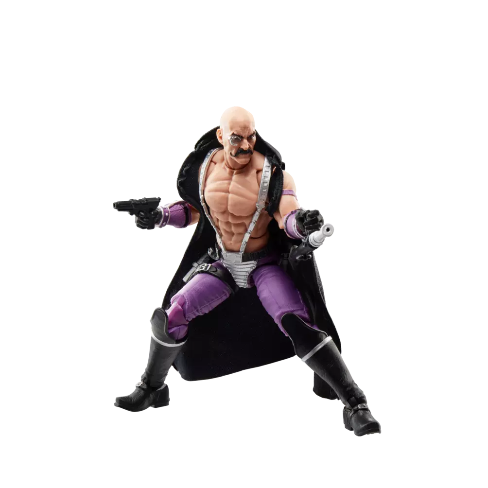
First is Dr Mindbender a mad scientist who seemingly decided that rather than wear an apron or lab coat to stop stuff spilling onto his clothes, he’d got bare-chested.

(I’m using Hasbro’s photography for this because I can’t be arsed to sort out my own)
This is a re-release of the Pulse Con or SDCC exclusive from a couple of years ago, on the retro cardback design and I think it’s pretty much identical, except for maybe one change. When they revealed the exclusive version, they talked about how they’d mimicked the magnification effect of his monocle by enlarging the eye in the paint job and then gluing the clear plastic monocle over it. That doesn’t appear to be the case here. The plastic monocle has magnification and if you manage to angle the figure to look at the eye around that, it looks normal size. That’s interesting.
Also interesting is his fabric cape. I don’t normally go for cloth goods on figures, but I think this is the best way to achieve this. The only alternative would be a vinyl one, which would be heavy and hard to pose (as I’ve found with superhero figures). That would be particularly bad for Mindbender given his other accessory of a belt canister and hose attachment, which is intended (I think!) to go round his back before attaching to one of his two pressure washer looking doodads. The hose does really interfere with the drape of the cape but it would have been worse with a rigid one. His weapons are a tad underwhelming. They’re modelled after the original figure (and the belt canister and replacement for a bulky backpack) but I don’t really get what they’re going for.
The bigger disappointment with Mindbender (and this is tangential) is that the colours don’t match the Cobra Techno-Viper. They are, weirdly, different shades of purple, which is such a shame because the series is so good at matching tones between figures usually and TechnoVipers would be the perfect flunkies for Mindbender. Ah well.
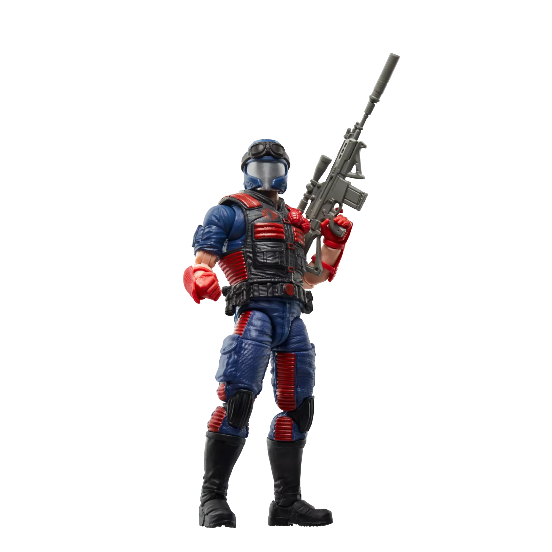
The other Classified figures I got were two Vipers. I’ve passed on a couple of releases of these before because there was something about the helmets that didn’t quite look right. Not just that the goggles (a nonsensical yet essential part of the design) aren’t hard-sculpted in, but something about the shape of the visor and positioning and size of the jawline bits.

In person though, they look fine from most angles and the goggles feel like they’re going to stay on (I’d have sculpted the helmets to accept the lenses of the goggles more securely, but hey-ho). They’re not solid figures and capture the spirit of the original.
You get quite a few accessories with the Vipers and honestly, I’d kinda say too many. I’d prefer a few less and £5 knocked off the price, but that clearly isn’t happening. You get a backpack, which has too soft a peg to confidently secure into the peghole on the figure; a pistol; two big guns – one a modern looking semi-auto, the other a grey rifle with some sniper-ish elements (such a removeable silencer). The grey one came with the original figure, the other is new. They both work and honestly, I’d have been fine with just either. You also get six hands in total – two gun grips, two fists, a pointing hand and an open palm. Again, they’re nice options, I guess (I’m never using the fists) but I don’t need that many. It feels like they’re throwing in unnecessary stuff to justify the price at times.
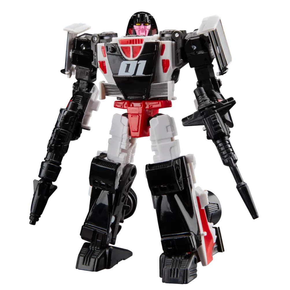
Something else I got recently is a Transformer. Except not really! It’s Crasher from Gobots but as a modern TF. Specifically a redeco of a recent Mirage figure.


It’s not got a unique Crasher head, instead a original toy-accurate Mirage head that they’ve managed to make look a fair bit like Crasher just through paint apps and that works. Obviously, Crasher wasn’t a (pseudo) F1 car in Gobots, but this mode suits her and the deco is nice. I was quite surprised when transforming it to find that the nosecone/front wing element that makes up her chest is actually a dummy and isn’t the front-wing and nose of the car mode (which is actually on the back of the legs). That’s not a design gimmick I’ve encountered before and is interesting.
Crasher’s got some decent weapons, but it’s a bit weird that one is clearly Mirage’s original shoulder cannon weapon but there’s no way to attach that to the figure’s shoulders.
2 users thanked author for this post.


