This is a thread to talk about character design.
Design Discussion Thread
Home » Forums » Comics talk » Design Discussion Thread
- This topic has 294 replies, 22 voices, and was last updated 2 years, 7 months ago by
 JRCarter.
-
Anonymous
InactiveJanuary 7, 2021 at 4:55 pm #49230bump bump bump bump bump
-
 njerryParticipant
 -
 ToddParticipantJanuary 7, 2021 at 6:16 pm #49242
Sounds like Anders fell down the stairs. Again.
He actually fell UP the stairs because, you know, Anders.
2 users thanked author for this post.
-
Anonymous
Inactive -
 JRCarterParticipantJanuary 7, 2021 at 8:21 pm #49258
5 Superhero Costume Redesigns That Worked (& 5 That Didn’t)
1 user thanked author for this post.
-
 JonParticipantJanuary 7, 2021 at 11:12 pm #49273
I love how the number 1 is probably not even a costume redesign, just an artist screwing up his rendition, but sure… put it at number one.
Also, that Thor costume is attrocious, but I kinda like that it’s the equivalent of any of the ridiculous female costumes, it’s a great exemple to use.
-
 JonParticipantJanuary 7, 2021 at 11:40 pm #49285
Speaking of weird 90’s costumes, here’s a question? What’s a costume you liked (90’s or not) that everyone hated? =P
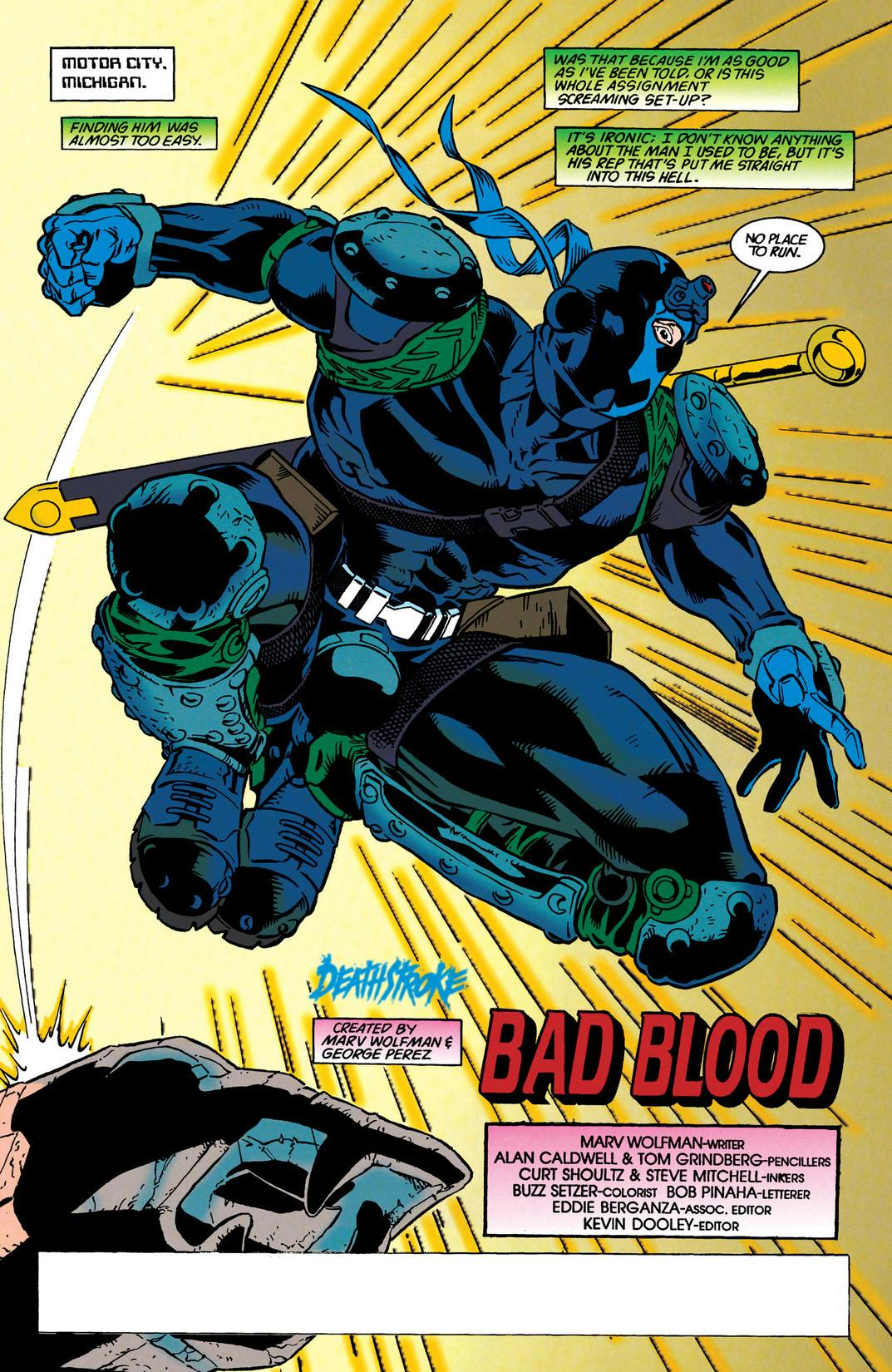
I have 2… the first one was the “deathsrtoke reborn” costume, I really liked what they did with the mask design and the darker colors (the green bits in the image below are supposed to be brown or grey), I thought he looked more like a ninja assassin badass and less like a spandex pirate weirdo…
And my second one is armored Daredevil, also from the 90’s… this one really only worked when Scott McDaniel drew it, particularly because at that point he was aping the shit out of Frank Miller (and I LOVED it, btw), but under any other artist it kinda looked like shit.

Also: I really wish McDaniel stuck with that style, he really produced some inspired art during that period.
-
Anonymous
Inactive -
 Will_CParticipant
 -
 ToddParticipantJanuary 8, 2021 at 2:03 am #49311
Also: I really wish McDaniel stuck with that style, he really produced some inspired art during that period.
I liked that costume too and completely agree about McDaniel’s art. His art was so ahead of his time during that period.
-
 JRCarterParticipantJanuary 8, 2021 at 2:21 am #49316
And my second one is armored Daredevil, also from the 90’s… this one really only worked when Scott McDaniel drew it, particularly because at that point he was aping the shit out of Frank Miller (and I LOVED it, btw), but under any other artist it kinda looked like shit.
Personally, I’d have switched the red and black parts.
-
 JonParticipantJanuary 8, 2021 at 4:13 am #49324
Oh man that nightwing costume is a great example… xD
I really don’t like it, although I dig the gold wings bit… but the rest is just too 70’s and I don’t really like the light blue… but again, great example… I can see why people love it.
Funny, I think it was precisely McDaniel who designed his next look, which was a lot more streamlined and modern…
I liked that costume too and completely agree about McDaniel’s art. His art was so ahead of his time during that period.
Well I don’t know if he was ahead since he was literally aping Miller, but it sure was a very cool style. I guess we should also give props to the inker(s) who might’ve also contributed a lot to the style, and at the very least did all the heavy lifting =P
Personally, I’d have switched the red and black parts.
mmm I don’t know if it’d work, because of the metallic bits… buy maybe… I would get rid of the neck red accents, they look weird. and I’d just make the metallic armor bits less spiky and overtaking, a more smoother fit I suppose…
1 user thanked author for this post.
-
 JRCarterParticipantJanuary 8, 2021 at 4:33 am #49327
The costume Joe Madureira (?) designed for Scarlet Witch around the time of Avengers: The Crossing:

1 user thanked author for this post.
-
Dave
Moderator -
 njerryParticipant
 -
 Martin SmithParticipantJanuary 8, 2021 at 5:17 pm #49406
I love how the number 1 is probably not even a costume redesign, just an artist screwing up his rendition, but sure… put it at number one.
It was a change requested by Stan Lee, who seemingly off-hand asked how Stark’s nose would fit in the mask, while he was editor (but no longer directly working on any of the books) and stayed until some time later, when, looking over the art for an issue of Iron Man, he was aghast to see the nose and asked why it had been added.
-
 Martin SmithParticipantJanuary 8, 2021 at 5:21 pm #49408
I always liked this version of the Wasp’s costume, even though I know it’s objectively kinda stupid (why have one leg bare right to the crotch?!). George Perez has this great ability to design naff costumes that you go with as long as he’s drawing them but look terrible if anyone else draws them or you think about it too hard.
1 user thanked author for this post.
-
 njerryParticipantJanuary 8, 2021 at 6:03 pm #49421
why have one leg bare right to the crotch?!
So she doesn’t have to remove the whole costume to pee. Obviously!
-
 DavidMParticipantJanuary 8, 2021 at 8:17 pm #49450
I have a vague memory of a Wimbledon controversy where a female tennis player wore an outfit with one bare leg.
But I can’t remember who or when… possibly I’m completely inventing the entire incident.
But anyway, let’s assume for the moment that it really did happen, and that’s proof that it’s a suitable costume choice for a female super-hero

1 user thanked author for this post.
-
 JonParticipantJanuary 8, 2021 at 9:39 pm #49460
That Scarlet Witch one is actually pretty good… would probably look better with a more modern touch.
The Sue “window boob” one is so ridiculous that it’s a classic at this point xD
And that’s a no on the Wasp one… it’s not even the puzzling one legged thing… none of it works, it looks like what an ice-skater would wear.
1 user thanked author for this post.
-
 garjonesKeymasterJanuary 9, 2021 at 5:12 am #49492
I always liked this version of the Wasp’s costume, even though I know it’s objectively kinda stupid (why have one leg bare right to the crotch?!).
Ask Jessie J

-
 JRCarterParticipantJanuary 9, 2021 at 6:22 am #49497
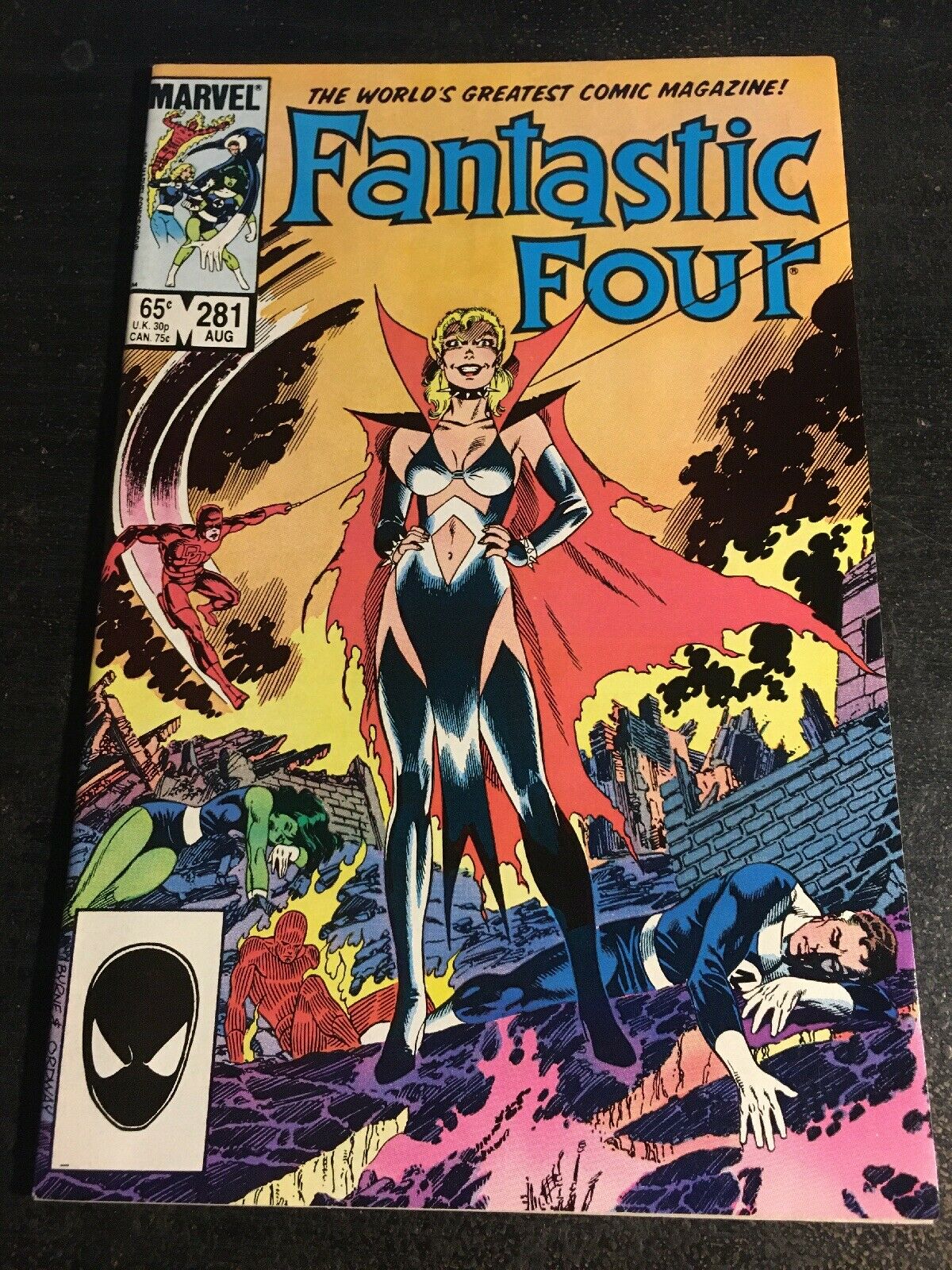
A lot of 90s costume redesigns were either ridiculously impractical or over-sexualised, but this one managed to give us a classy new look that is definitive as far as I’m concerned.

Fun fact: Paul Ryan (RIP) once said after he designed that costume, his wife made him sleep on the couch.
3 users thanked author for this post.
-
 DavidMParticipantJanuary 9, 2021 at 12:55 pm #49534
after he designed that costume, his wife made him sleep on the couch.
…while she changed into it?
-
 JonParticipantJanuary 9, 2021 at 10:47 pm #49622
I mean, to be fair, wasn’t Sue like… possessed by someone else or some bullshit like that at the time?
-
 Steve SensibleParticipant
 -
 JonParticipantJanuary 10, 2021 at 12:17 pm #49695
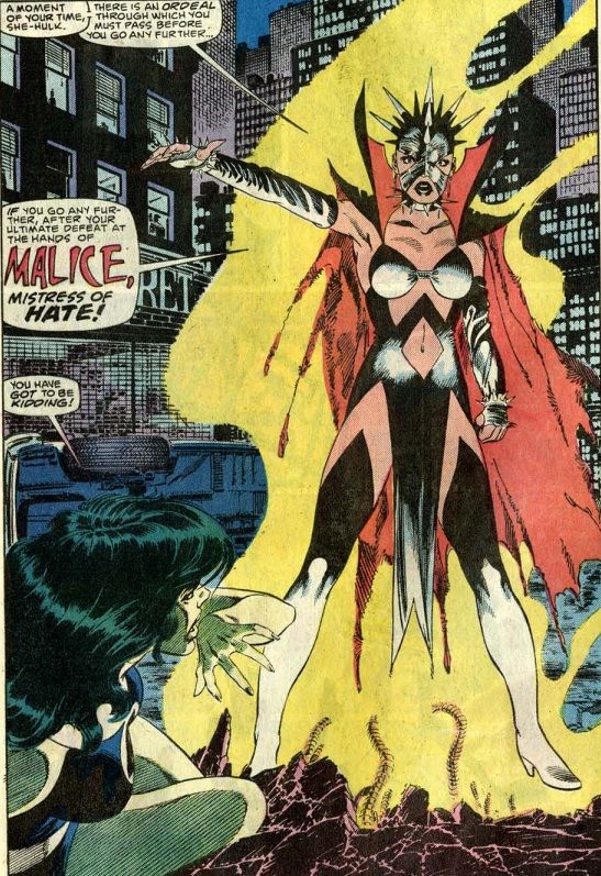
Ah yes… it’s probably that… huh, I thought that boob window costume was related, but I guess not… Anyhow, that Malice costume if pretty crappy too…
-
 Steve SensibleParticipant
 -
 Martin SmithParticipant
 -
 JRCarterParticipantJanuary 10, 2021 at 6:24 pm #49788
https://marvel.fandom.com/wiki/Susan_Storm_(Malice)_(Earth-616)
Yeah, it was Sue’s Malice personality coming back that caused the change.
-
 JonParticipantJanuary 10, 2021 at 11:05 pm #49832
ahhh so I was semi-right! =P
-
 RocketParticipantJanuary 11, 2021 at 6:53 pm #49963
about Evs’ video: i ask the same question but i don’t care to listen to some bitter old comicsgater’s response
edit: did not realize there was another page.
About Wasp: she was trying to be a fashion designer so she had a number of impractical costumes.
Malice was a intangible mutant who also possessed Lorna Dane.
-
This reply was modified 5 years ago by
 Rocket.
-
This reply was modified 5 years ago by
-
 JRCarterParticipantJanuary 12, 2021 at 12:22 am #50020
Malice was a intangible mutant who also possessed Lorna Dane.
Actually, there has been more than one Marvel character named Malice.
-
Anonymous
InactiveJanuary 12, 2021 at 12:31 am #50022I always liked this version of the Wasp’s costume, even though I know it’s objectively kinda stupid (why have one leg bare right to the crotch?!).
Ask Jessie J

That smile really screams “KILL ME NOW”.
-
 JRCarterParticipant
 -
Anonymous
InactiveJanuary 12, 2021 at 3:59 am #50037Is that a Gambit-styled face-condom?
-
 JonParticipantJanuary 12, 2021 at 4:57 am #50040
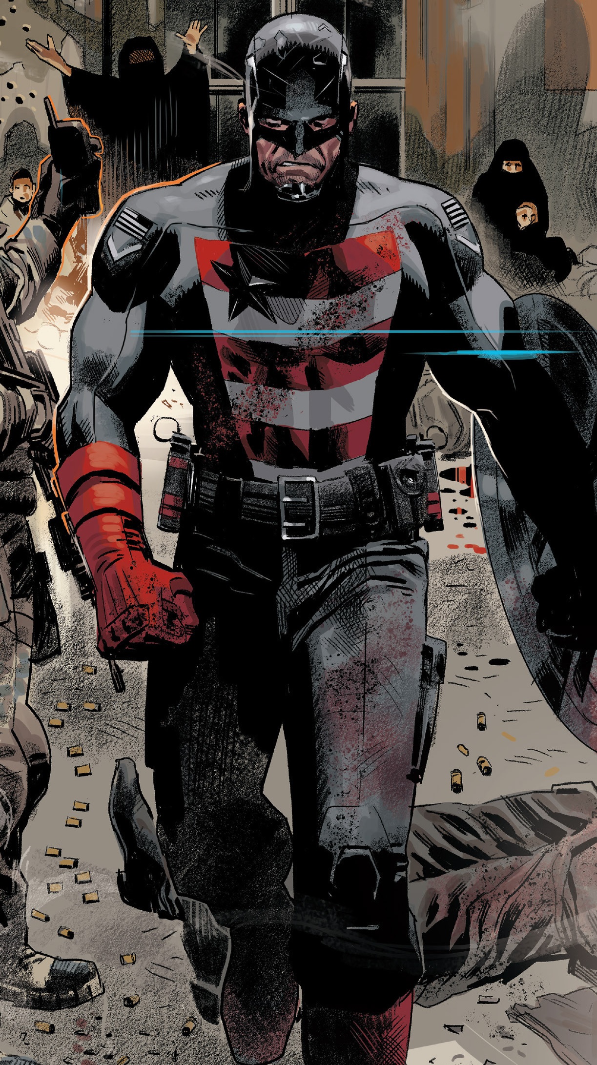
I mean, I don’t necessarily hate his “new” costume:

It’s more the fact that he’s all of a sudden super skinny for some reason… oh and the “US” on the shield is a no-no.
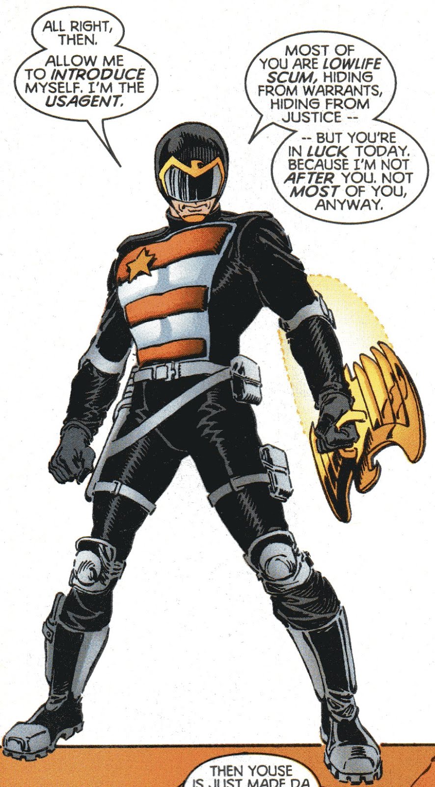
I still think a more modern rendition of the OG design works best. It’s actually a pretty cool Cap-alt costume, so they should just stick with that, something like this:
His worst costume was definetly when they turned him into a Judge Dredd wanna-be…
-
 JonParticipant
 -
Dave
ModeratorJanuary 12, 2021 at 10:14 am #50058I always liked this version of the Wasp’s costume, even though I know it’s objectively kinda stupid (why have one leg bare right to the crotch?!).
Ask Jessie J

That smile really screams “KILL ME NOW”.
Or “I was drawn by Gary Frank”.
1 user thanked author for this post.
-
 JRCarterParticipantJanuary 15, 2021 at 2:42 am #50469
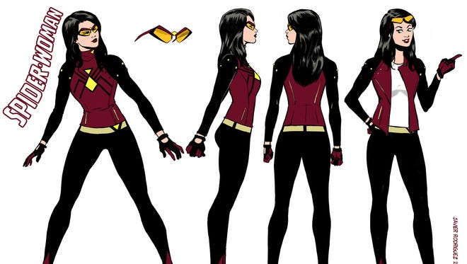
Since Spider-Woman is going back to her original costume, this seemed appropriate:
-
 JRCarterParticipantJanuary 16, 2021 at 5:11 pm #50743
Gleb designed more than one new costume for Damian. WE haven't even shown them all yet. Turning the son of the bat into a fashion icon. pic.twitter.com/pfmwnKqLNZ
— Joshua Williamson (@Williamson_Josh) January 14, 2021
-
 JonParticipant
 -
 JRCarterParticipantJanuary 16, 2021 at 9:23 pm #50794
I saw this bouncing around, so looks like I can post it! Incredible cover to #BlackWidow 6 by @AH_AdamHughes AND Widow’s new costume, by @LaraWest.
😍😍😍 If you weren’t already on board, you should get on now! pic.twitter.com/JMXb2gHDV5— KELLY THOMPSON (@79SemiFinalist) January 15, 2021
-
 JonParticipantJanuary 16, 2021 at 9:35 pm #50795
Oh that’s a nice design.

-
 JRCarterParticipantFebruary 1, 2021 at 7:36 pm #52916
 -
 JRCarterParticipantFebruary 3, 2021 at 3:23 pm #53174
"They’re not nearly scared enough. But they will be." #scarecrow new design, hope u like it, friends! @tomeu_morey colors🔥
March 2. #DCInfiniteFrontier
And #batman #106
@thedcnation @DCComics pic.twitter.com/ARFTL5IyCI— Jorge Jiménez (@JorgeJimenezArt) February 2, 2021
1 user thanked author for this post.
-
 RocketParticipantFebruary 3, 2021 at 3:30 pm #53175
I think it is an interesting take on Scarecrow. the fingers especially.
-
Dave
ModeratorFebruary 3, 2021 at 4:27 pm #53184I think it is an interesting take on Scarecrow. the fingers especially.
That part reminds me a little of the version from the Arkham videogames.

1 user thanked author for this post.
-
 ToddParticipantFebruary 3, 2021 at 4:46 pm #53190
"They’re not nearly scared enough. But they will be." #scarecrow new design, hope u like it, friends! @tomeu_morey colors🔥
March 2. #DCInfiniteFrontier
And #batman #106
@thedcnation @DCComics pic.twitter.com/ARFTL5IyCI— Jorge Jiménez (@JorgeJimenezArt) February 2, 2021
His head looks like a cross between a hedgehog and an aardvark.
And with the needles on his hands, it must be hell going to the bathroom.
1 user thanked author for this post.
-
 DavidMParticipantFebruary 5, 2021 at 2:55 pm #53393
And with the needles on his hands, it must be hell going to the bathroom.
1 user thanked author for this post.
-
Dave
Moderator -
 RocketParticipantFebruary 5, 2021 at 3:25 pm #53405
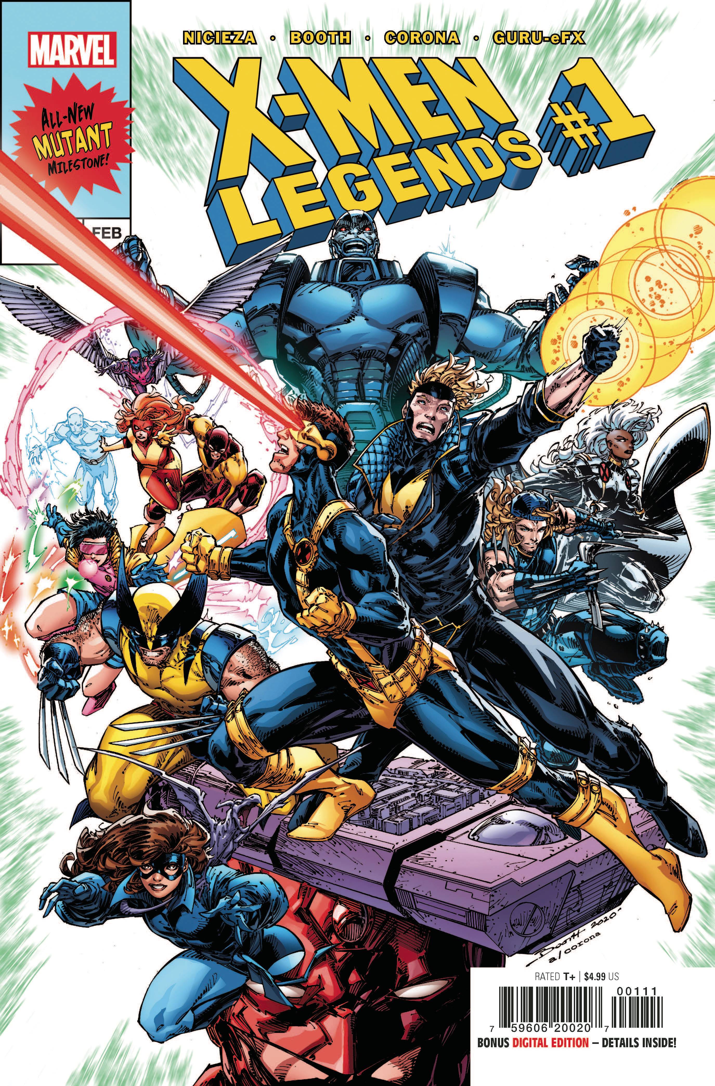
I like Booth’s art but this is a mess. That said, who thought it was a good idea to bring back those ugly original x factor uniforms? Basic colors and giant Xs, ugh!
-
 JonParticipantFebruary 5, 2021 at 6:12 pm #53421
Who’s the douchebag with the backwards cap?
Also, yeah the X-Factor costumes are very meh, but damn the rest (minus douchebag) look sooo good in their 90’s costumes.
-
 JRCarterParticipantFebruary 5, 2021 at 6:52 pm #53425
Who’s the douchebag with the backwards cap?
Adam-X:
https://marvel.fandom.com/wiki/Adam_Neramani_(Earth-616)
1 user thanked author for this post.
-
 JasonParticipantFebruary 6, 2021 at 3:01 am #53475
I always liked this version of the Wasp’s costume, even though I know it’s objectively kinda stupid (why have one leg bare right to the crotch?!).
Ask Jessie J

That smile really screams “KILL ME NOW”.
Or “I was drawn by Gary Frank”.
It’s kind of fascinating how certain people look like they were drawn by a certain artist.

John Kerry looks like he was drawn by Carlos Ezquerra.

And Matt Smith is a Frank Quitely character who walked off of the page.
-
 JonParticipantFebruary 6, 2021 at 3:27 am #53476
yep… never heard of him… xD
-
 JRCarterParticipantFebruary 8, 2021 at 4:11 pm #54836
A Chaotic Ranking Of The Scarlet Witch’s Comics Costumes
https://www.kotaku.com.au/2020/04/a-chaotic-ranking-of-the-scarlet-witchs-comics-costumes/
-
 JRCarterParticipant
 -
 JRCarterParticipant
 -
 JRCarterParticipantFebruary 18, 2021 at 1:29 am #55602
We’ll be sharing more in the coming weeks and months, but in the meantime, here’s a look at some of my early character designs for the book: pic.twitter.com/7YgBdSN0pt
— Joe Quinones (@Joe_Quinones) February 16, 2021
-
 JonParticipantFebruary 18, 2021 at 9:19 am #55622
Ha, he used the toy design for the “underarmor” thingie… nice =P
-
 RocketParticipantFebruary 19, 2021 at 3:45 pm #55759
A closer look at Quinones’ designs reveals a joker that looks a lot like Prince who did some music for that Batman movie.

-
 JRCarterParticipantMarch 16, 2021 at 6:30 pm #58199
See how the X-Men glow up for Marvel’s version of the Met Gala
https://ew.com/books/x-men-marvel-hellfire-gala-preview/
1 user thanked author for this post.
-
 RocketParticipantMarch 17, 2021 at 1:59 pm #58269
Good thing Jean and Storm can fly because those shoes are not feasible for anything other than posing. Rachel and Betsy are horrid and could use major overhauls.
-
 JonParticipantMarch 17, 2021 at 11:00 pm #58373
Storm and Jean’s are barely passable, the rest are absolutely horrible. Why is this even a thing? =/
-
 ToddParticipantMarch 18, 2021 at 1:48 pm #58415
As this is in conjunction with a riff on the Met Gala, the outfits are quite appropriate. Outfits worn by guests (usually celebrities) for the Met Gala are known for being outrageous and over the top. Google “Met Gala Fashion” and look at pictures of actual outfits. You’ll see that the X-Men attire would fit in quite well.
That doesn’t mean the X-Men and actual outfits aren’t ugly though…
1 user thanked author for this post.
-
 JRCarterParticipantMarch 25, 2021 at 5:06 pm #59313
Batwoman’s Future Costume Highlights Flaws in Female Character Design
https://screenrant.com/batwoman-costume-flaw-female-character-design-dc-comics/
-
 RocketParticipantMarch 26, 2021 at 7:02 pm #59457
That’s actually Future Batwoman rather than Batwoman’s future. not even Kate Kane behind that mask
-
 Steve SensibleParticipantMarch 31, 2021 at 9:28 pm #59819
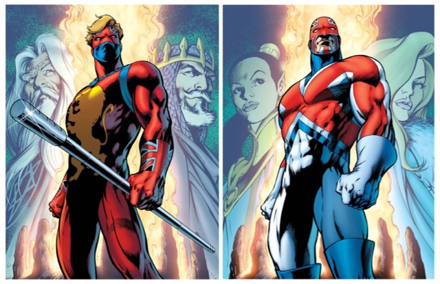
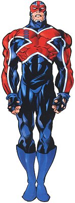
Which is your preferred Captain Britain costume and why?
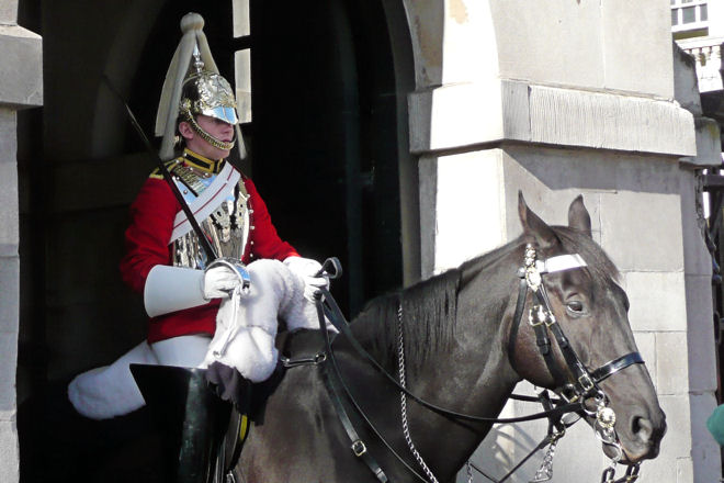
I’m a huge Alan Davis fan, but I could never get onboard with the costume he designed. I get his point that the original costume wasn’t a good representation of Britain (the lion is more English than British) but his costume is just a bit much. The flag on the chest AND the helmet (which is in itself ugly) makes it all too complicated, and as for those thigh-high boots… the less said, the better! I get that they’re supposed to be inspired by the Royal Horse Guards, but they also wear this monstrosity on their heads.
The original is a classic costume, IMO – even the wavy hair looks good (in a 1970’s kind of way…) and the sceptre was just cool!
-
 ToddParticipantMarch 31, 2021 at 10:25 pm #59824
I’m not sure I have a favorite.
When I first started reading comics in earnest, it was the Davis red, white, and blue that was in the comics I read so I guess that is what I am used to. I lean toward that one out of familiarity, if anything.
I’ll be honest, I’m not wild about either. They’re both okay but neither really grabs me. They both feel a bit generic to me. The original reminds me a bit of Daredevil. The Davis one feels like a bit of a riff on Captain America.
Has he worn another outfit that might be better?
-
 Steve SensibleParticipantApril 1, 2021 at 6:39 am #59852
Has he worn another outfit that might be better?
There have been minor refinements to the Alan Davis costume that tried to make the union flag on the helmet more abstract rather than literal, but the only other outfit I’m aware of is this one. No mask/helmet at all which is kind of lame.
-
Dave
ModeratorApril 1, 2021 at 8:02 am #59857Which is your preferred Captain Britain costume and why?

-
 garjonesKeymasterApril 1, 2021 at 8:21 am #59862
I can’t be objective in this. Davis’ CB is a touchstone for me in reading superhero comics. If I see CB drawn by Davis at any time my day gets happier, emotionally for me it’s perfect.
Also the old one is very English and I don’t like that aspect either.
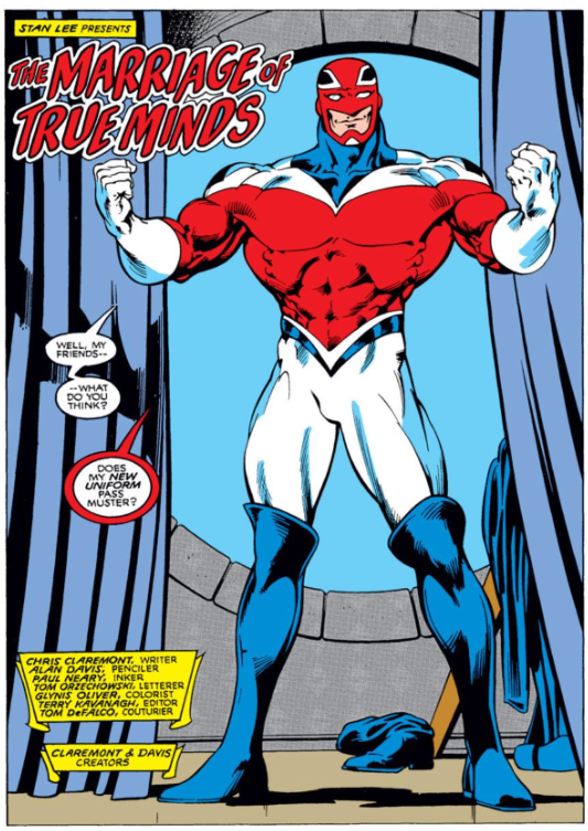
I know practically it’s pretty hard to draw the helmet bits so Davis himself did this simplified version when he worked on Excalibur:
-
 JasonParticipantApril 3, 2021 at 8:35 pm #60051
Which is your preferred Captain Britain costume and why?
I’m a huge Alan Davis fan, but I could never get onboard with the costume he designed. I get his point that the original costume wasn’t a good representation of Britain (the lion is more English than British) but his costume is just a bit much. The flag on the chest AND the helmet (which is in itself ugly) makes it all too complicated, and as for those thigh-high boots… the less said, the better! I get that they’re supposed to be inspired by the Royal Horse Guards, but they also wear this monstrosity on their heads.
The original is a classic costume, IMO – even the wavy hair looks good (in a 1970’s kind of way…) and the sceptre was just cool!
The one on the right.
I like the way it sort of takes the Union Jack design and turns it into a “X,” which is appropriate for the leader of an X-Men offshoot team. (Being an American, my first experience with Captain Britain was in Excalibur.)
-
 RocketParticipant
 -
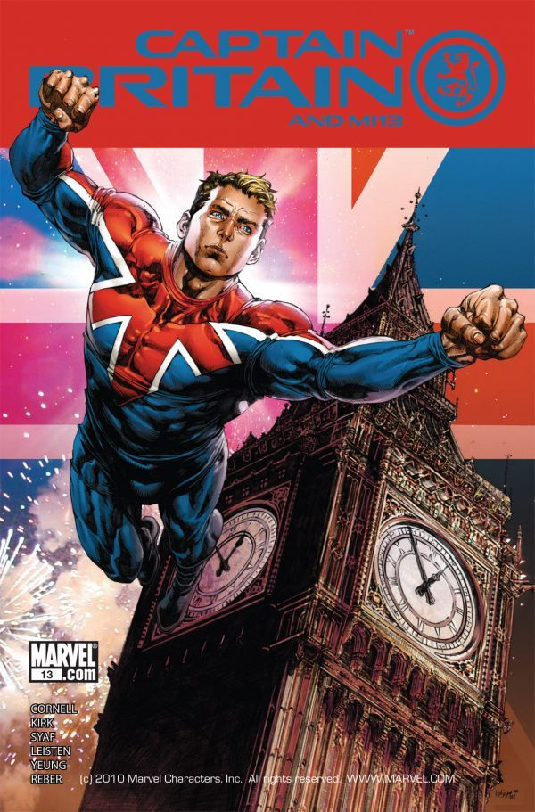
 JRCarterParticipantApril 5, 2021 at 8:24 pm #60172
Can we agree that this is his worst look?

4 users thanked author for this post.
-
 Steve SensibleParticipantApril 6, 2021 at 7:18 am #60207
Good Lord. I hesitate to ask but… what was the context for that?
-
Dave
ModeratorApril 6, 2021 at 9:30 am #60214Good Lord. I hesitate to ask but… what was the context for that?
The 90s.
3 users thanked author for this post.
-
Dave
ModeratorApril 6, 2021 at 9:32 am #60215More seriously:
-
 Steve SensibleParticipant
 -
 garjonesKeymaster
 -
 ToddParticipantApril 6, 2021 at 1:17 pm #60225
Can we agree that this is his worst look?

Yes, we can.
Damn, that picture is just SOOO 1990s in every possible way. And that’s not a compliment.
-
 Steve SensibleParticipantApril 6, 2021 at 1:44 pm #60226
Damn, that picture is just SOOO 1990s in every possible way. And that’s not a compliment.
Needs more pouches if you ask me.
1 user thanked author for this post.
-
 Tobias RadesäterParticipantApril 6, 2021 at 3:46 pm #60243
For 1990s comic book art, I think it’s pretty good. There is a background with details in it, the bulges represent real muscles you can find in a real human, the foot is connected to the ground.
The suit however, is horrible. And it must look really boring on some distance, when it’s just red with some black lines on it.
-
This reply was modified 4 years, 10 months ago by
 Tobias Radesäter.
-
This reply was modified 4 years, 10 months ago by
 Tobias Radesäter.
1 user thanked author for this post.
-
This reply was modified 4 years, 10 months ago by
-
 JRCarterParticipantApril 6, 2021 at 4:07 pm #60247
Nothing about it says “Britain”.
-
Dave
ModeratorApril 6, 2021 at 6:15 pm #60270Nothing about it says “Britain”.
It’s shitter than it used to be, it’s striking a pose that’s meant to look powerful but actually comes off as a bit stupid, and overlooking it all is a smug wanker peering out from underneath a mop of unkempt blond hair.
I don’t know what more you could want.
-
 JRCarterParticipantApril 7, 2021 at 8:21 pm #60380
This one is…okay:
-
 JRCarterParticipantApril 27, 2021 at 7:12 pm #61914
Marvel reveals more incredible X-Men fashion looks for the upcoming Hellfire Gala
https://ew.com/books/marvel-reveals-more-x-men-fashion-hellfire-gala/
-
 RocketParticipantApril 28, 2021 at 1:43 pm #61956
hmmm, Jumbo Carnation(Marvel artists) has a certain style to his fashion. To me, the only men who will be happy at this thing will be Logan and Synch.
-
 garjonesKeymaster
 -
Dave
ModeratorApril 28, 2021 at 4:09 pm #61964Grant Morrison creation in New X-Men I think.
-
 garjonesKeymasterApril 28, 2021 at 4:11 pm #61965
That makes sense, a very Morrison character. I have no memory of him in the run at all but maybe that’s my fault or he appears very fleetingly.
-
Dave
ModeratorApril 28, 2021 at 4:14 pm #61966Me neither! I just looked him up. I don’t remember him playing a significant role.
-
 garjonesKeymaster
 -
 JonParticipantApril 29, 2021 at 3:17 am #61999
Marvel reveals more incredible X-Men fashion looks for the upcoming Hellfire Gala
https://ew.com/books/marvel-reveals-more-x-men-fashion-hellfire-gala/
Jeeeesus… I’m not even gonna bother… xD
-
 JRCarterParticipantApril 29, 2021 at 6:44 pm #62037
 -
 Martin SmithParticipant
 -
 RocketParticipantApril 30, 2021 at 4:01 pm #62104
2.
-
 JRCarterParticipantMay 10, 2021 at 3:10 am #62992
The new Authority designs! pic.twitter.com/XPpmFETVQh
— Mikel Janín (@mikeljanin) May 8, 2021
-
 RocketParticipant
 -
 JRCarterParticipantMay 10, 2021 at 5:16 pm #63023
Plus, is it just me, or does Clark not look right without a cape?
- You must be logged in to reply to this topic.




:format(webp):no_upscale()/cdn.vox-cdn.com/uploads/chorus_asset/file/22299790/static_design_DC_Comics_2021_milestone.jpg)
